Case study
Ámbar
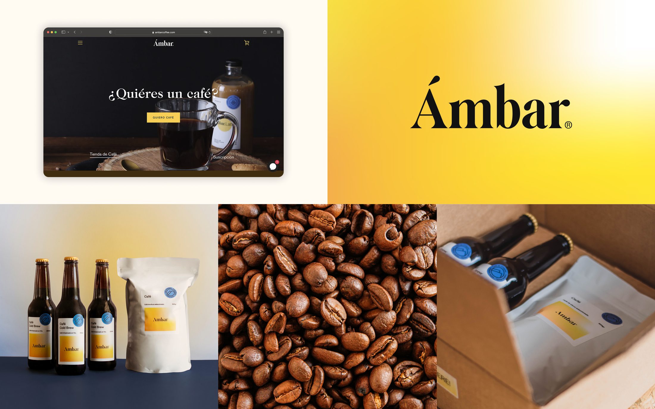
A specialty coffee brand built on one idea: simplicity that works. I made everything but the logo — the name, the identity, the packaging, the cold brew itself, and the store it sells from.
Founder & Design Engineer · Brand & E-commerce Designer
The premise
A love of coffee, met with what I already knew how to build.
Ámbar started from two things I had: a genuine love of specialty coffee, and years of building brands and stores on Shopify. Instead of waiting for a client brief, I set out to make my own — a small specialty coffee brand I could take all the way, from the name to the cup to the checkout.
The bet was that a focused, well-crafted brand doesn't need to shout. It needs to be clear, warm, and effortless to buy from. Everything followed from that.
My role
I owned the whole brand, end to end.
I led every part of Ámbar except the logo: the naming, the visual identity (palette, typography, art direction), the packaging, the product photography, the cold-brew line itself, and the design and build of the Shopify store.
Doing all of it meant the brand stayed coherent from the bottle to the website to the buy button — the same feeling carried through every touchpoint, because the same person made every one of them. The Shopify storefront got the same care as the label: designed in Figma before a line of it was built, then tuned so it reads like Ámbar, not a theme.
Process
From a name to something you can order.
Brand & identity
Named it Ámbar — warm, like the color of cold brew — and built the identity around restraint: a tight palette, one typographic voice, and packaging that says only what it needs to.
The product
Built the brand around a specialty bean from within Mexican coffee — driven less by a business plan and more by wanting to share a coffee I loved, not just drink it. I took a simple product, coffee, and designed the whole experience around it — from bean to bag to buy button. And this is only step one — the product and the brand; step two is a coffee bar, where people meet Ámbar in person.
The store
Designed and built the Shopify storefront myself, tuned for one thing: making it effortless to understand the product and buy it, especially on a phone.
Into the world
Brought Ámbar to people in person with a pop-up — packaging, signage, and experience all part of the same simple, warm system.
Key decisions & rationale
Three choices that shaped the brand.
Simplicity as the whole system
Restraint isn't a style here, it's the strategy. A tight palette, one voice, packaging that says only what matters — nothing competing with the coffee. Simplicity that works: easy to recognize, easy to trust, easy to buy.
Let the market pick the hero
Ámbar launched around cold brew — it's in the name, it's the color, it had the point of view. But running the brand on a real P&L taught a colder lesson: RTD bottles are logistics-heavy and margin-thin, while bags ship, keep, and reorder. So the hierarchy flipped: bags lead, cold brew signs. Designing a brand includes redesigning it when reality reports back.
A store that gets out of the way — and then repeats
I built the Shopify store to disappear: fast, mobile-first, stripped to the path from "this looks good" to "it's on its way." And then to repeat: the storefront is built subscription-first, because a coffee brand doesn't sell bags — it sells a ritual. The brand does the seducing; the store makes it easy, then makes it recurring.
What came of it
A real brand, live and selling.
What I took from it
Simplicity that works.
Ámbar is the clearest expression of how I like to design: take something out until only what matters is left, then make that part excellent. Building a brand I could touch — packaging, product, photography, a real store — stretched me past screens and proved I can own an identity end to end, not just a product UI.
A printed label doesn't take a hotfix. Running a physical brand taught me to make decisions like they'll be printed — fewer, earlier, better. I brought that judgment back to every screen I design.