60 min
4/12Vinyasa Flow
8 spots left
Design system
One shared base, each studio's personality.
Eclipse is a booking platform for yoga, Pilates and training studios. Each studio has its own instance (about nine today), and all of them come from the same code. Eclipse UI is the design system I made so each one looks like its studio without forking that code and without lowering the quality.
System design, interface design and development · One person
A barre studio and a HIIT box shouldn't look the same, but in Eclipse the only thing that changed from one instance to another was the brand color. Views wrote their colors by hand: across the 17 public views there were 442 loose references to variables ([var(--color-…)]), 207 Tailwind palette classes (gray-500, white…) and 48 icons pasted in as <svg>. Changing a studio's voice or shape meant editing view by view, in every instance.
On top of that, the base brand color, a gold (#a3946b), was used as text and as a button background: it measured between 2.7 and 3.0:1, and WCAG AA asks for 4.5:1. Across five pages, axe found 58 elements with insufficient contrast.
What I needed was a system that separated two things: what every studio deserves equally and what makes each one different.
The base is what doesn't change from one studio to another, and if a component breaks one of these guarantees, it isn't done: truly accessible (measured AA contrast, visible focus, full keyboard support, reduced motion respected); only tokens and scales, never a loose color or size; hierarchy through layers and 1 px borders, with shadows saved for what floats; physical motion; integrated with Rails (controls send their value with name:, work with Turbo and with the form builder), and code that belongs to whoever uses it, with no black boxes.
The personality is what each studio decides, in five traits:
| Trait | What changes |
|---|---|
| Voice | typefaces, weight, italics, uppercase and width of the titles; the voice of the buttons |
| Shape | roundness, pill or square buttons and fields, how marked the borders are |
| Color | brand, ink, paper and how much the brand tints the grays |
| Air | how compact or airy the interface is, how much shadow floating things get |
| Rhythm | how fast everything moves and how much the important things glow |
The traits move with 27 dials that fit in one theme.css block. The engine derives the rest: the palette, the hover states, the text on the brand, the layers, the shadows, the radii and the durations. I started from six personalities designed for different kinds of studios, and each one is a starting point, not a closed theme:
| Personality | For | Character |
|---|---|---|
| Carbón | sober interfaces | monochrome, Inter and JetBrains Mono, 1 px borders |
| Eclipse | the app's base | warm gold, Fraunces for titles, calm |
| Alba | spa, barre, wellness | mauve, Cormorant in italics, everything in pills, lots of air, slow |
| Brisa | clinical Pilates, physical therapy | sage green, Manrope, small radii, compact and fast |
| Umbra | box, HIIT, cycling | vermilion on black, Archivo condensed in uppercase, everything square |
| Terra | yoga, community | terracotta, soft Fraunces and Nunito, the brand tints the grays |
Bringing one to a studio means copying its block into theme.css and moving the dials it needs. Everything else realigns on its own.
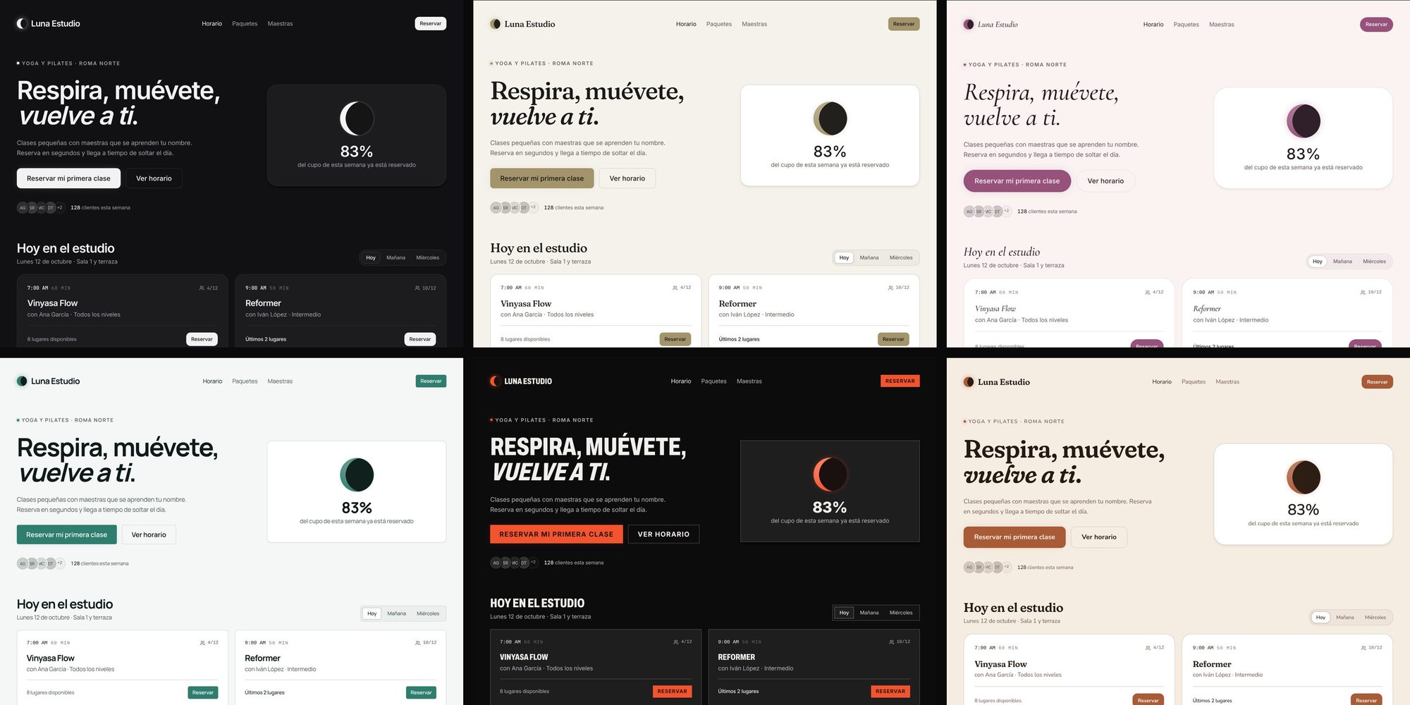
The same class card in three of the six starting personalities. The card's code doesn't change, only the dials.
60 min
4/12Vinyasa Flow
Eclipse. Warm gold on paper, Fraunces for titles, calm. For warm, editorial brands.
Alba. Mauve, Cormorant in italics, everything in pills, lots of air, slow. For wellness, beauty and editorial brands.
Umbra. Vermilion on black, Archivo condensed in uppercase, everything square, fast. For sport, energy and high-contrast brands, shown in dark, its natural mode.
A system that promises AA contrast in any combination of dials can't be checked by eye. So the base has guardians that run with the tests:
config/eclipse_ui/contrast.yml) is measured in a real browser in the six personalities and in the studio's theme.css, in light and dark: 308 measurements in 0.6 s. A browser measures them because the engine derives colors with color-mix(in oklab) and oklch(from …), and reimplementing that in Ruby would be a second copy of the engine that sooner or later would say something different from the screen. If a studio picks a brand color that makes some text unreadable, the test says which one.rounded off the scale or a hand-written variable where there's a named utility.Contrast stopped being an aesthetic decision: brand-colored text uses text-primary-text, a derived tone that passes AA in every personality (5.7:1 at minimum), and the text on a brand button is picked automatically (6.0:1 on the gold).
Everything below is rendered by the same engine, with the Eclipse personality.
Brand, ink, paper and tint go in. Surfaces, text, borders and states come out, mixed in oklab.
Dials
Surfaces and lines
Text and brand
States
One text font for the whole interface, a mono for data and labels, and each personality's display voice for titles. If a size isn't on the scale, it doesn't exist.
One density dial, from 0.85 to 1.2, multiplies padding, gaps and control heights. An airy brand breathes; a compact one tightens.
One roundness dial multiplies every radius, so the whole app rounds or straightens with the brand. A personality can turn buttons and fields into pills, or square them off, without touching cards.
Components that feel alive usually come from React libraries. Eclipse is Rails with Stimulus, so I wrote the physics from scratch: spring.js is 127 lines with no dependencies, with a fixed-step integrator (1/240 s) that behaves the same on a 60 Hz screen as on a 120 Hz one.
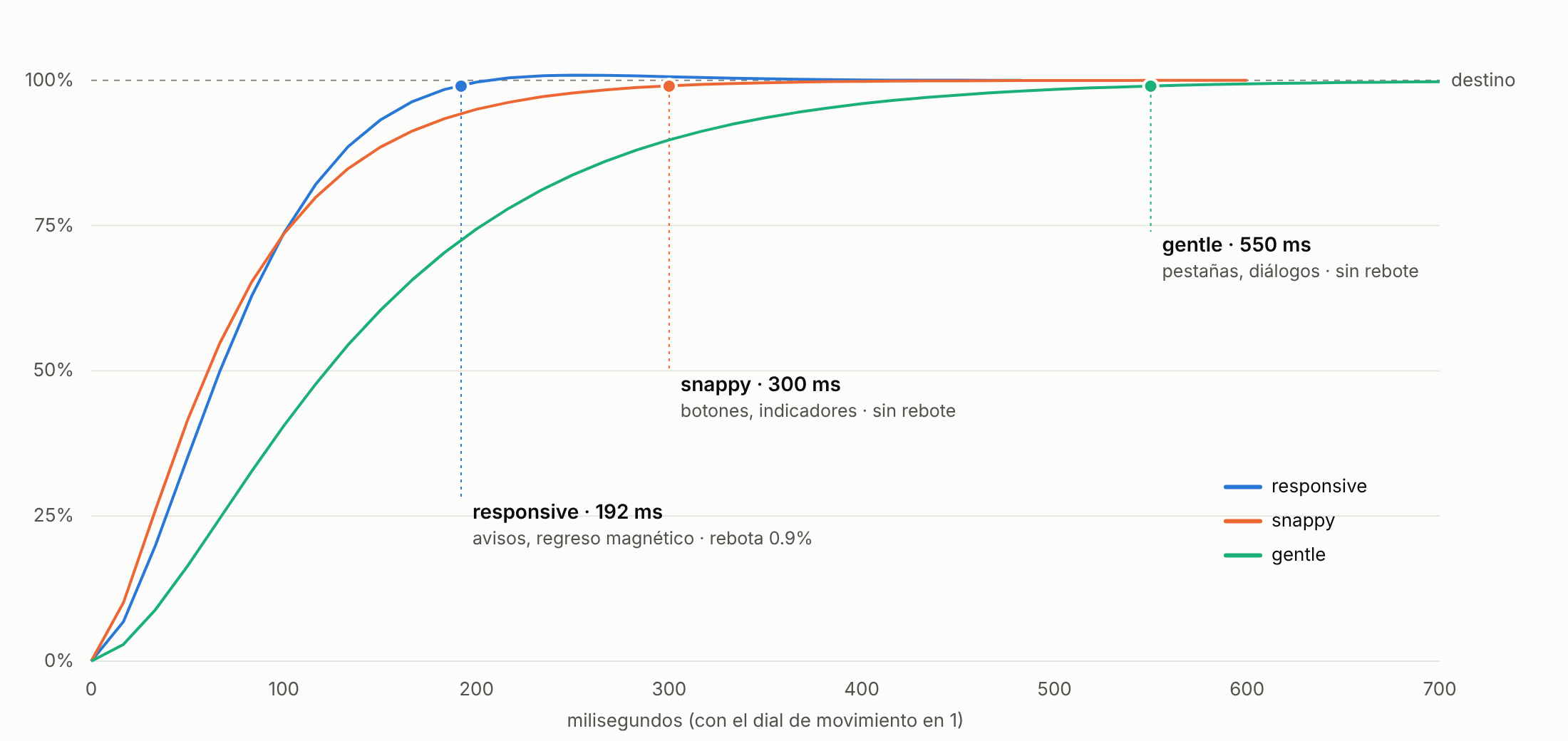
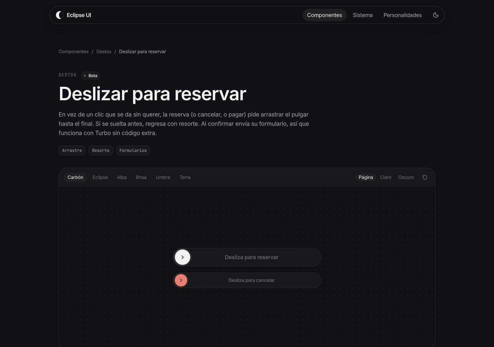
snappy gets within 1% of its target in 300 ms (buttons, indicators), gentle in 550 ms (tabs, dialogs) and responsive in 192 ms, with a 0.9% bounce saved for returns and toast stacks.--eui-motion) scales the time of every spring and of the CSS transitions, and with prefers-reduced-motion everything jumps to the end.Today 34 Stimulus controllers use it: slide to book, rolling digits, tabs with a sliding pill, modals that settle, toasts you can drag away.
The real test was dressing the demo's entire public site in the components: navigation, footer, notices, confirmations, home, schedule, class, pricing, contact, sign in, sign up, account and About. The screenshots use the same database in both versions; only the code changes.
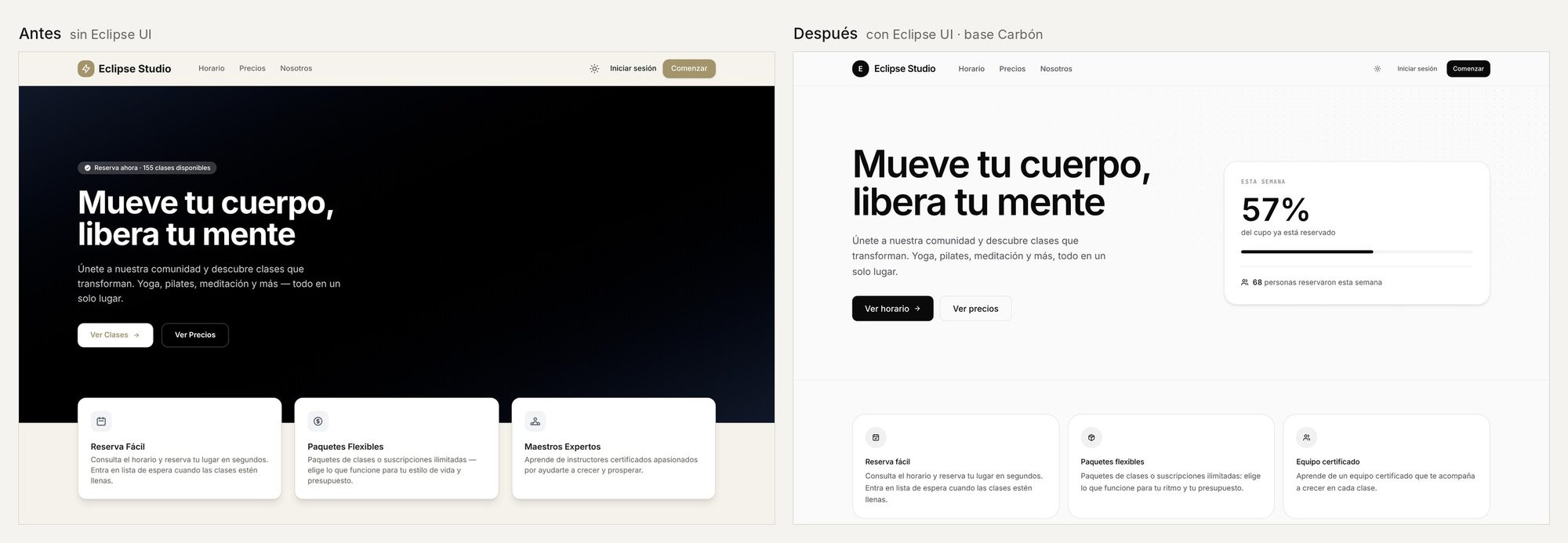
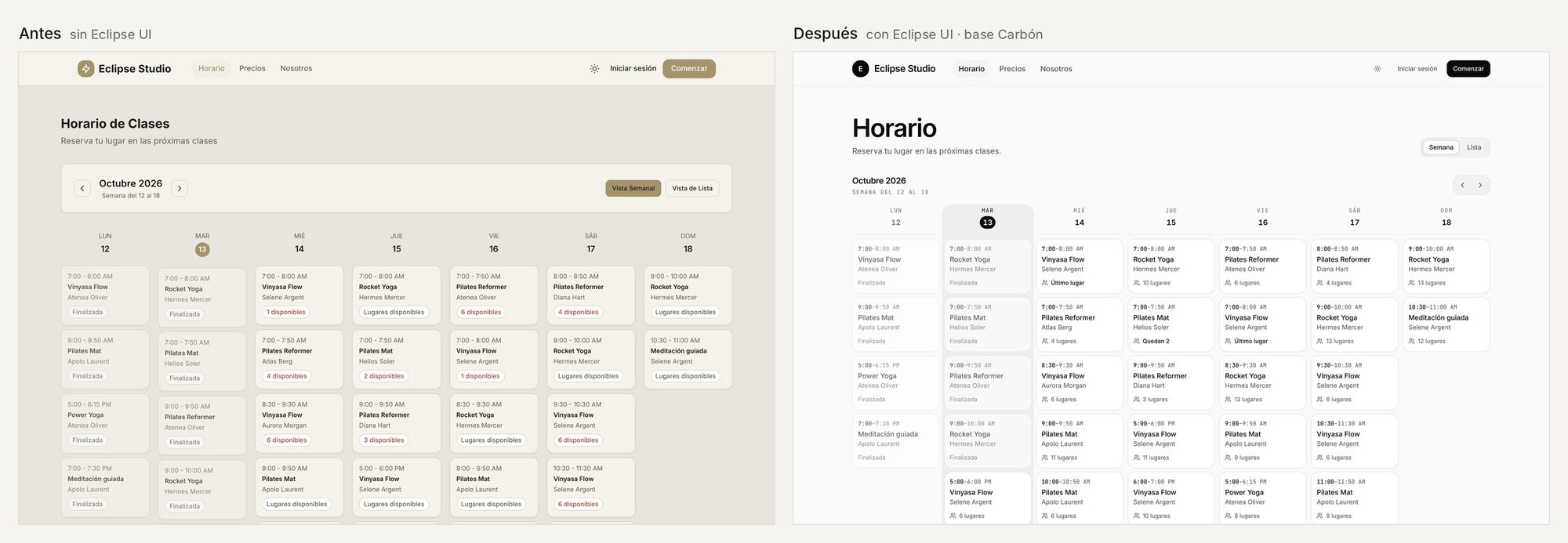
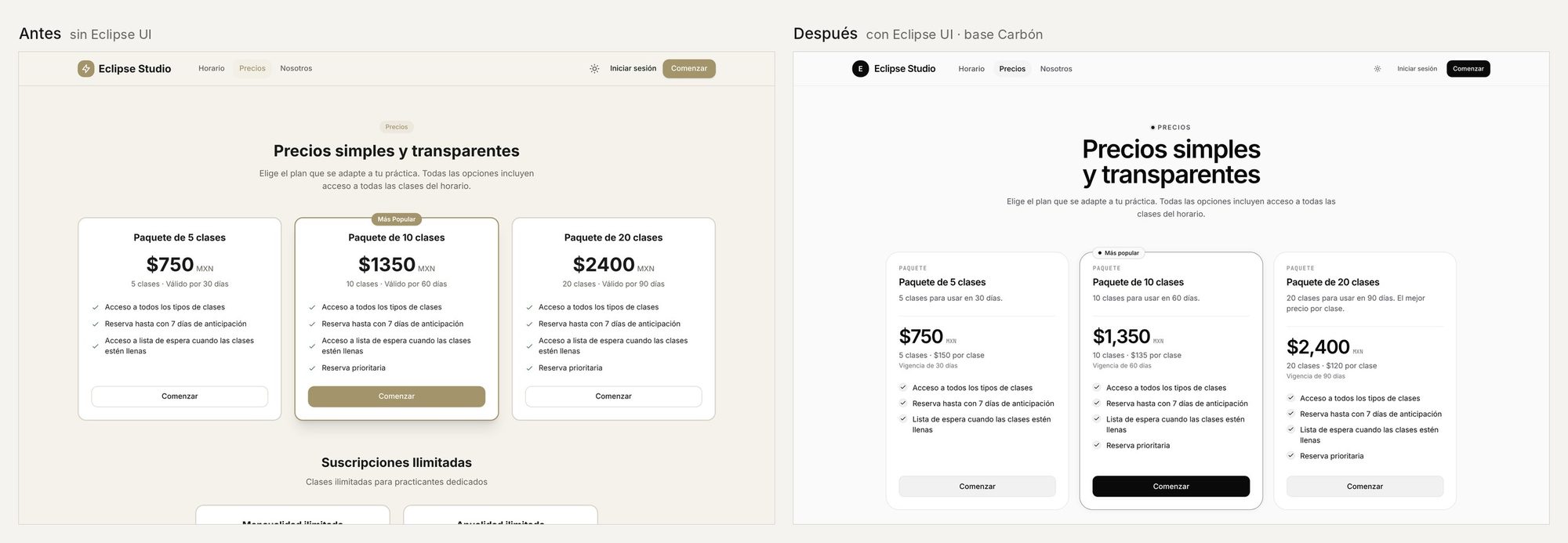
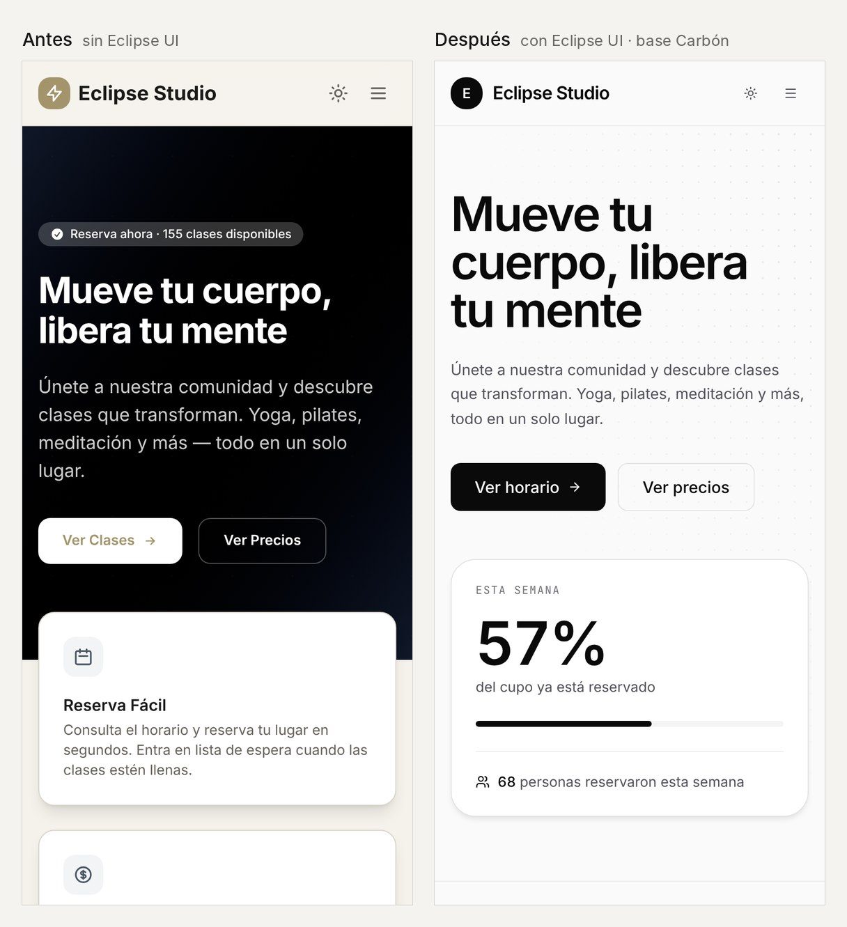
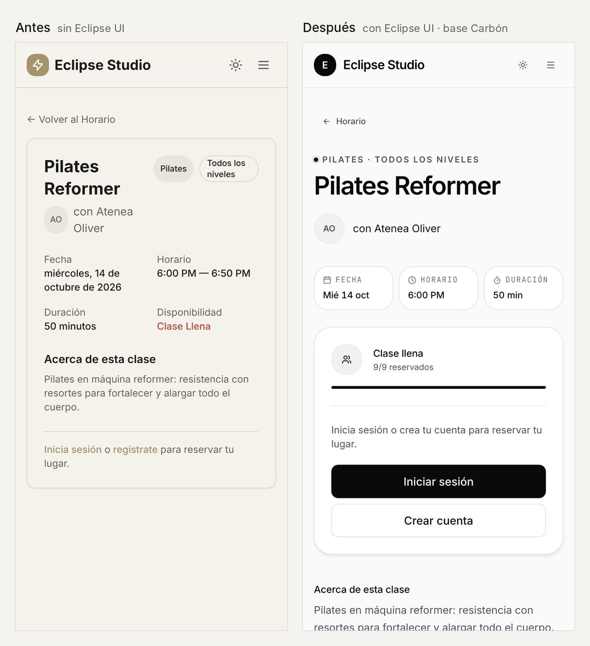
What changed in the code of the public views:
| Metric | Before | After |
|---|---|---|
| Lines of ERB | 1,695 | 1,470 |
Hand-written colors ([var(--color-…)]) | 442 | 0 |
Tailwind palette classes (gray-*, white…) | 207 | 0 |
| Tailwind shadows that don't follow the dial | 24 | 0 |
Pasted <svg> | 48 | 0 |
| Eclipse UI components used | 4 | 19 |
What changed in accessibility (axe 4.10, WCAG 2.1 AA, on home, schedule, class, pricing and sign in, on desktop in light mode):
| Insufficient contrast | Before | After |
|---|---|---|
| In the content (the gold as text or background, grays on paper) | 48 | 0 |
| In the dark footer (faint text on black) | 10 | 0 |
| Total | 58 | 0 |
The footer was the last to fall: its labels and credits used text-faint, at 3.66:1 on black, and the system itself says text-faint isn't for text that has to be read. Now they use text-muted-foreground. On the phone and in dark mode, axe still flags small labels in the schedule and the class with that same tone (from 3.4 to 4.3:1); that's the next thing to align.
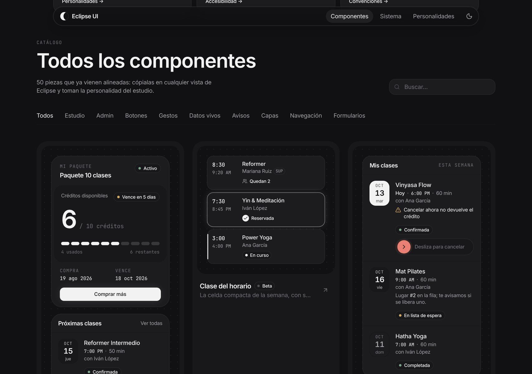
The public catalog has 42, each with a live demo, props, an ARIA pattern and keyboard support. These four, with their states, in the Eclipse personality.
It tells you what's happening with the action: it spins while it books, draws a check when it's done, and if something fails, it shakes and says so.
The field takes care of the label, the help text, the error and the ARIA wiring. Units and icons sit inside it.
10-class pack
Reformer: 45 min minimum
One look for the status of orders, payments, bookings and subscriptions. The color never goes alone: the status always reads as text.
What a table, a list or a section shows when there's nothing yet: it says what's happening, what to do, and offers the action.
No classes this week yet
Schedule the first one from a template and it will show up on the studio's schedule.
No cancellations this week
When someone cancels, you'll see it here with their credit returned.
Eclipse UI was born inside Eclipse. For it to work outside the app, it had to stop being part of it.
eclipse_ui). Eclipse uses it as a read-only copy that updates with one command (bin/update_eclipse_ui), and tests prevent editing it inside the app. The booking pack (class, schedule, packages, booking…) stayed in Eclipse: it's what sets it apart from other studio software.eclipse-ui.css) and, for each personality, its theme.css, its shadcn.css and its DESIGN.md.shadcn.css is measured. It carries shadcn/ui's values measured in a real browser on top of the engine and converted to OKLCH. The reason is the same as with contrast: measure what the screen paints instead of reimplementing the engine.DESIGN.md is for the AI. It's a set of instructions for an AI agent (Claude Code, Cursor) to apply the personality on every screen: which tokens to use, which rules to follow and what would make the app look AI-made.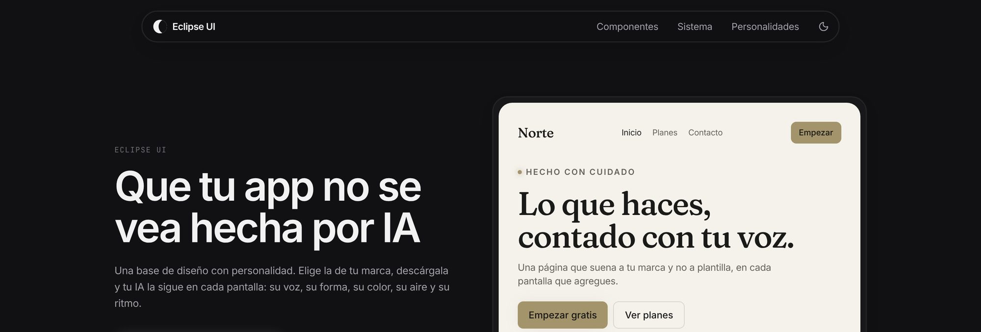
docs/GUI.md) and a set of instructions for the agent that writes the UI make new code come out with tokens, physics and accessibility from the start.What's next: bring the studio dashboard (what the owner uses every day) to Eclipse UI and test in real Safari and Firefox.
How it was measured: the screenshots and axe 4.10.3 ran in Chromium with Playwright, at 1440 × 900 and 390 × 844, against Eclipse's commit 99cdd64 (before Eclipse UI) and against main, with the same database. The code count runs the Ui::Guardrails rules over the same public views in both commits (17 files before; 19 after, because two partials came out of them). The spring timings simulate spring.js with its own integrator and a 100 px travel.
Related