Case study · CEDIM
The New Roadmap —
An academic platform
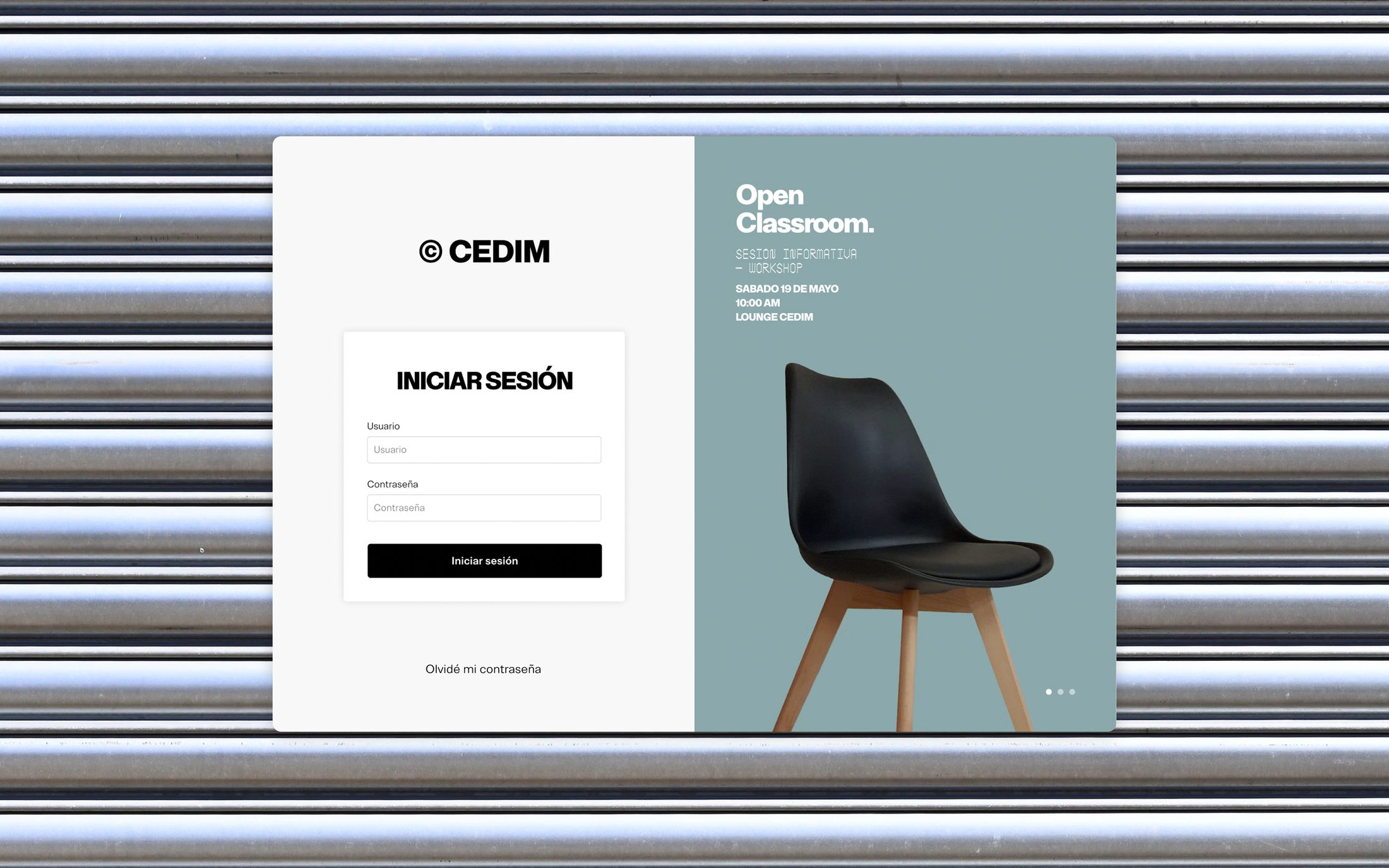
A ground-up redesign of the platform where design students at CEDIM run their whole academic life — schedule, documents, assignments — bringing a pre-2010 system up to the standard of the design school it serves — now in production for the school's ~5,000 active students.
UX · UI · Design System
The challenge
A platform that worked — but felt a generation behind.
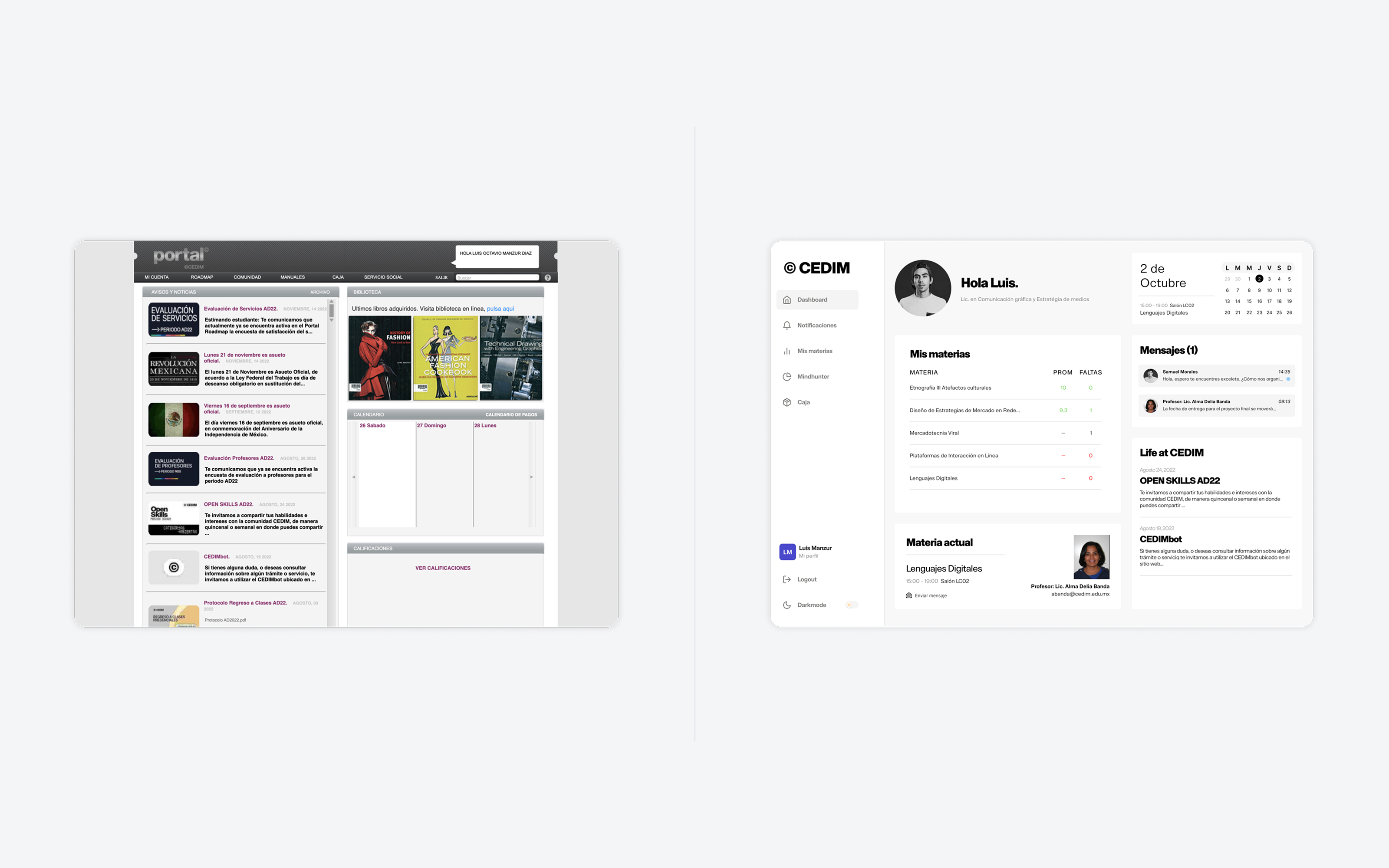
CEDIM's academic platform is where students see their schedule, upload documents, track assignments, and manage their whole academic life — essentially a simpler Blackboard. The problem: it hadn't been meaningfully updated since before 2010. It functioned, but it looked and felt dated.
That gap mattered more here than it would anywhere else. CEDIM is a design school — its students evaluate interfaces every day, and the institution's whole identity is built on design. The platform needed to stop feeling like generic school software and start feeling like it belonged to a design university. All of it, without rebuilding the system underneath.
My role
UX, UI, and the system — shipped through another team's hands.
I owned UX, UI, and the design system; development stayed with the institution's team, and the roadmap answered to CEDIM's leadership. That shaped the job: my designs didn't ship because I built them — they shipped because another team could build them and the school approved them.
The work ran on the institution's cadence — monthly sprints, with progress reviewed against leadership's priorities — and was validated where it counts: usability testing with students. Coming up through CEDIM myself gave me a head start on where the platform got in the way; testing with current students kept that instinct honest.
Process
Modernize the experience, not just the paint.
Audit the old platform
Mapped what students relied on most — schedule, documents, assignments — and where the dated experience slowed them down.
Restructure the information
Reorganized a student's whole academic life into a clearer hierarchy, so each task had an obvious place instead of being buried in a pre-2010 layout.
Solve the dashboard
Worked out what the home screen should lead with and how — the central design problem of the whole project (below).
UI & design system
Designed a modern, design-school-worthy interface and a component system to keep it consistent — choosing patterns that were both an upgrade and technically feasible.
Key decisions & rationale
The decisions that defined the redesign.
What the dashboard leads with — and how
The hardest call was the home screen. Schedule, assignments, documents, announcements — everything competed for the top spot. Rather than dump every module at once, I prioritized the time-sensitive view: today's classes and what's due next, so the dashboard answers "what do I need to do right now?" the moment a student logs in.
Designing within legacy constraints — together
Because development used the existing system, feasibility wasn't a filter I applied alone — it was a standing conversation with the dev team. I'd bring a pattern; they'd tell me what the legacy platform could render; we'd land on the version that kept the experience gain without breaking their build.
The discipline: favor the real, shippable upgrade over the ideal mockup that never goes live — and spec each screen completely, states and edge cases included, so "not buildable" gets discovered in a sprint review, not after one.
Holding a design-school bar
For an institution whose product is design, the interface itself is a credibility statement. So I held the visual and interaction bar higher than a typical internal tool, and aligned the look and feel with CEDIM's design-forward identity.
The handoff
Designed to survive the handoff.
When you don't control the build, the spec is the product. Every screen shipped with its states documented — loading, empty, error, edge — and the design system gave the dev team components to assemble instead of pixels to interpret. The cycle ran on the institution's scrum: monthly sprints, reviews with the dev team and school leadership, and iteration between spec and build until it was right.
Outcome
Live at a design school.
What I took from it
The best design is the one that can ship.
Designing for designers raised my own bar — there's no hiding sloppy craft from an audience that does this for a living. And working inside hard technical constraints taught me that the strongest design isn't the most ambitious mockup; it's the best experience that can actually go live. Reorganizing something as broad as a student's entire academic life also sharpened how I think about information hierarchy and the dashboard question: of everything you could show, what matters most, right now?